Are you still struggling to convert more website visitors into email subscribers?
Or perhaps you’re new to blogging, and you don’t know the best way to promote your lead magnet.
You’re not alone.
Every day I hear bloggers, content marketers, and small business owners talk about how they’re not getting enough leads and subscribers for their business.
And if you’re not getting more leads, then you can’t build a sustainable and profitable business long term.
So if want more leads and subscribers, then in this post I’m going to show you 9 different ways to promote your lead magnet as well as 18 examples from leading marketing experts.
You don’t necessarily need to use all the different ways to promote your lead magnet, but even using 2 or 3 of these strategies can help increase your optin conversions dramatically.
If you don’t know what a lead magnet is or haven’t yet created one, then see my post on the 7 essential elements of a lead magnet.
1. Landing Pages
When most people think of creating and promoting lead magnets, they think of the landing page.
Although there are many other great ways to promote your lead magnet — which we’ll go over in this post — the landing page is still the most used and important in terms of conversions.
Landing pages are well suited for paid advertising because you can create pages that are extremely relevant to your target audience.
For example, I came across this lead magnet by Jeff Walker when I clicked on a Facebook Ad. It’s very simple yet compelling. I want to know what the “one thing” is behind the most successful product launches.
Landing Page to Webinar
I’ve noticed a lot more marketers are starting to use webinars as lead magnets on their landing pages. It’s a great way to build rapport, trust and credibility with your audience and the conversion rates will tend to be higher than other types of lead magnets.
Amy Porterfield offers a free live masterclass on webinars as a lead magnet.
Neil Patel also offers an advanced customer acquisition webinar as a landing page.
2. Featured Box
Adding a featured box in the hero section of your homepage can be a great way to get more optins because it’s the first thing people see.
The homepage is usually the most highly visited page on a site, so you’ll get a lot of eyeballs on it.
Here’s how a few savvy marketers use a featured box on their homepage (notice also how all the forms are above the fold):
Brian Dean from Backlinko:
Brendon Burchard uses the featured box on his homepage perfectly.
3. Popup Boxes
Popup boxes are those boxes that appear when you visit a website — usually after a set amount of time (i.e 30 seconds).
Popup boxes are another great way to capture leads. In fact, adding popup boxes have been known to increase conversions by as much as 50%!
Note: Although popup boxes are great, they can also get really annoying if there’s a popup on every single page of your site and your visitor has to see repeatedly. So make sure to use it sparingly and add certain conditions so that they don’t distract or annoy your reader.
You can easily create popup boxes using Thrive Leads, OptinMonster, or Optimonk. The lead generation software we’re using at SimpleStartup to create these optin boxes is Thrive Leads.
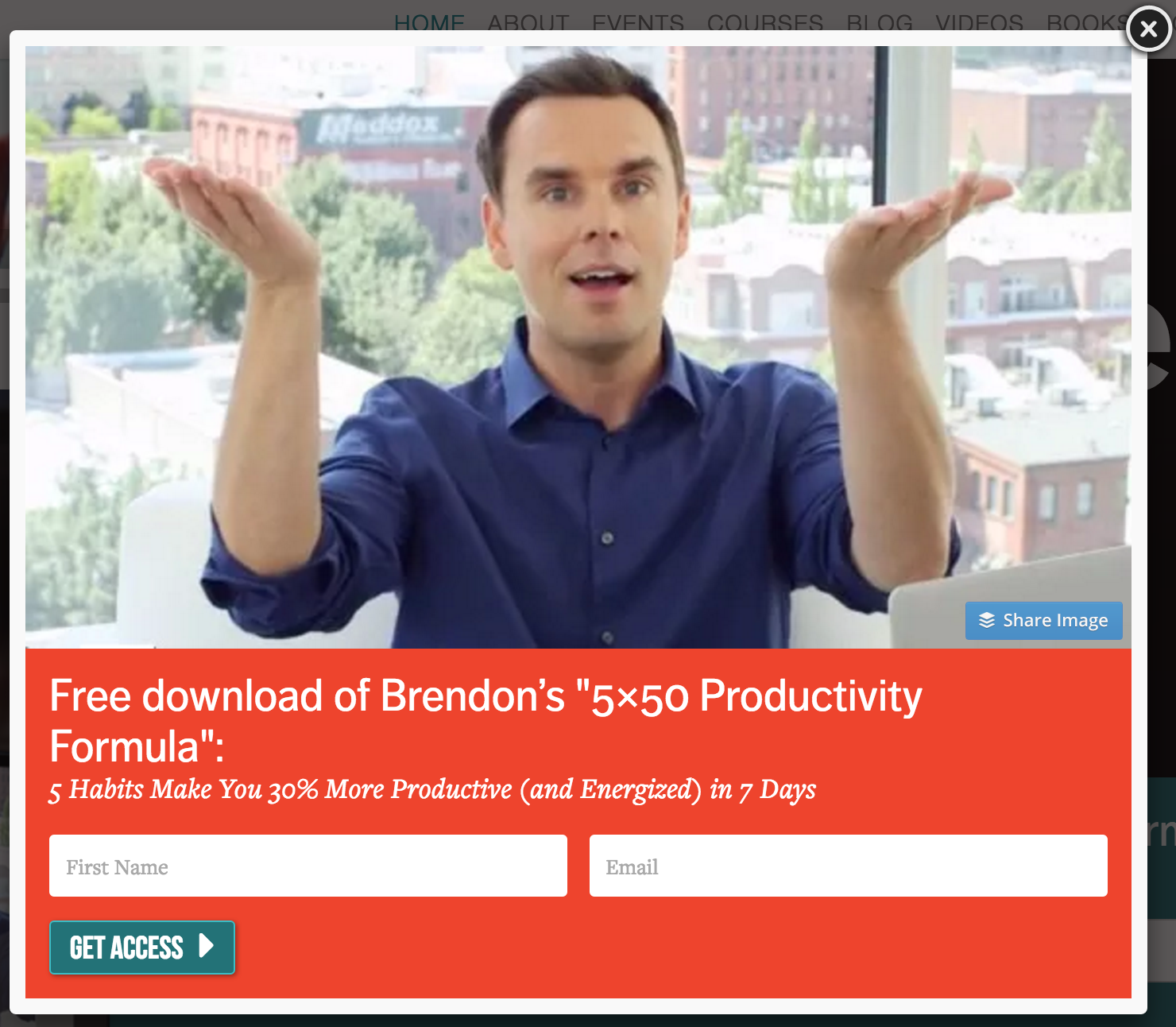
Here’s how Brendon Burchard uses a popup box at brendon.com. It’s got a nice picture of him teaching the 5×50 productivity principle in his studio.
It’s also compelling since it’s very specific, unique and relevant to his target audience: aspiring high performers.
Tim Ferris uses this popup box targeted towards people who want to learn a foreign language. Notice that in this variation, you can give the visitor the option to accept or decline.
4. Content Upgrades
Adding a lead magnet within the body of your article is called a content upgrade.
A content upgrade can be anything (template, resource, tools, etc.) as long as it’s relevant to the post.
Because these lead magnets are so relevant content upgrades can be a significant source of leads.
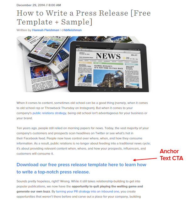
According to a Hubspot study, 47% to 93% of all their optins came from content upgrades (or what they refer to as Anchor text CTAs).
Here’s how how it looks within the body of an article:
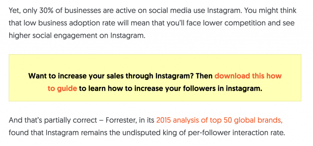
Here’s another example of a content upgrade (this time within a box to draw attention to it):
5. Sidebar
Another great and common place to add a lead magnet is in the sidebar — especially on your blog; it can help increase the amount of optins you get.
I would recommend putting at least one lead magnet in the sidebar so that you maximize your chances of someone signing up.
Neil Patel offers a free traffic course on his QuickSprout blog.
At Digital Marketer, you’ll find this 10-minute social media audit lead magnet on the sidebar of their blog.
It’s a simple design, but a compelling offer. The red “free download” draws the eyes to the offer.
6. Footer
Getting people to subscribe to your blog can be challenging. It’s also not as compelling as a lead magnet because you’re not really getting anything unique other than updates on the latest blog posts.
However, it’s still a great way to get people on your email list and stay in touch.
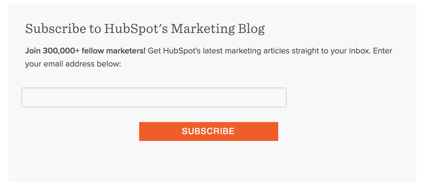
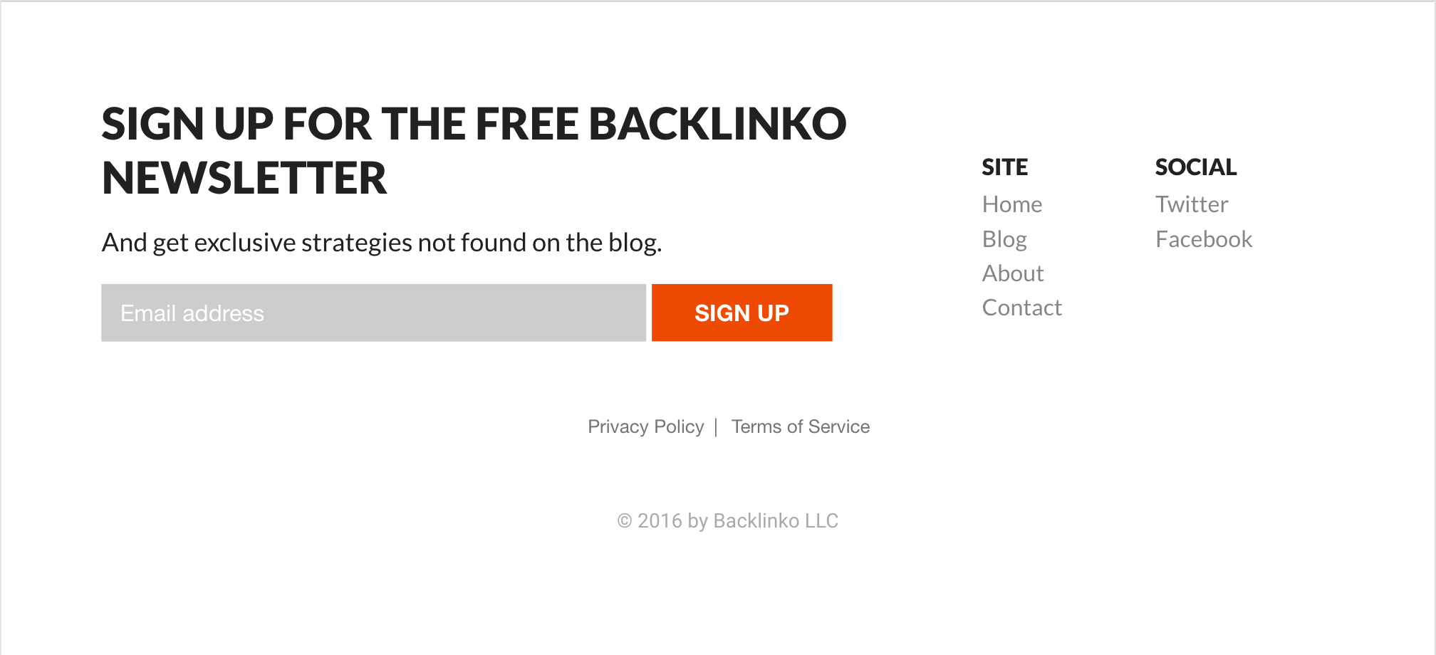
Here’s how Hubspot does it in the footer of their site:
Here’s another example of a footer optin by Brian Dean:
7. End of the blog post
Placing a lead magnet at the end of a blog post can be effective.
Although it’s not nearly as effective as a content upgrade — Hubspot said it contributed to only 6% of the posts total leads — it’s still good to add one at the bottom of each of your blog posts.
Neil Patel added this end of the post lead magnet on one his SEO posts:
Hubspot added this lead magnet on one of their writing posts:
Notice that it’s not just a generic lead magnet that can apply to anyone. It’s targeted towards writers and it appealed to me since I’m a writer.
8. Pinned Tweets
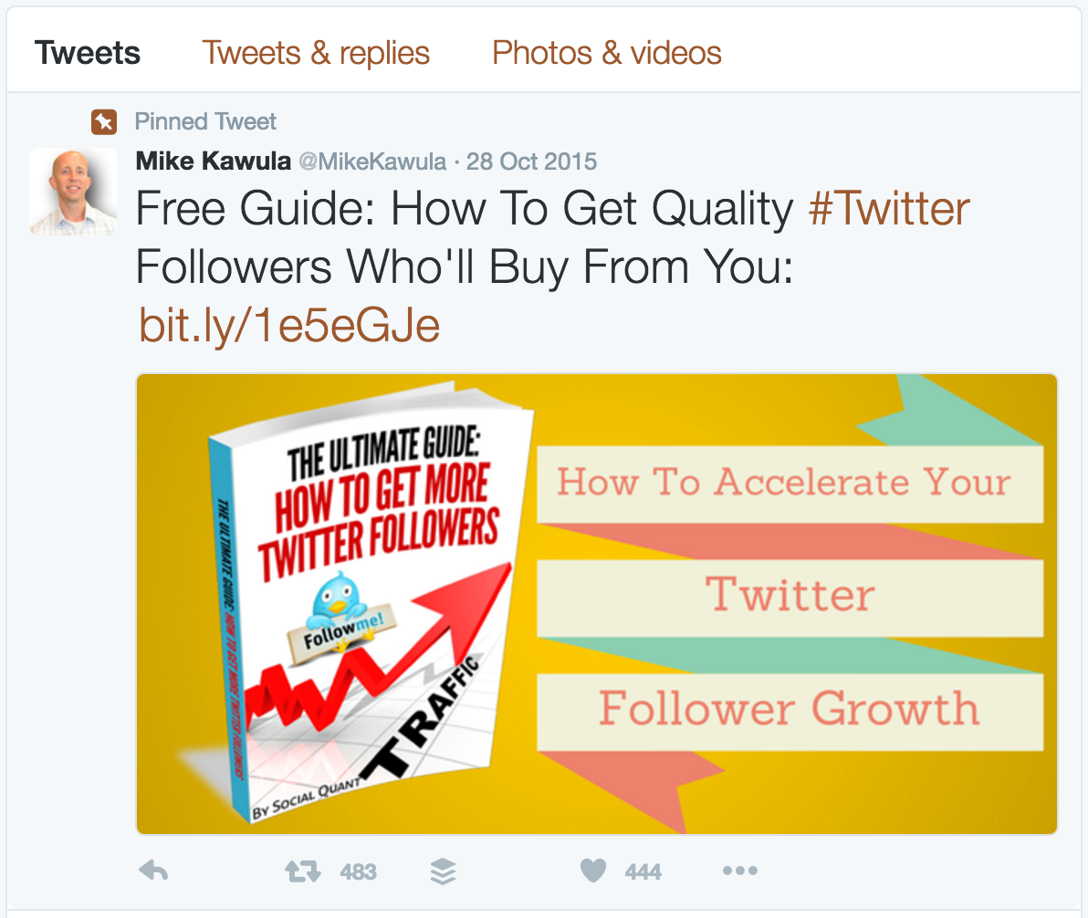
Not a lot of people use their twitter account to promote their lead magnet. I didn’t really take it seriously either until Mike Kawula from Social Quant emphasized it in our email discussion:
“Engaging helps, creating good content and pin a tweet. Pinned Tweets drive tons of traffic with what we do.”
When people visit your twitter profile if it’s the first thing they see above the fold other than your header, bio and profile photo. So this is prime real estate and great way to drive more traffic to your lead magnet landing page.
Here’s one from Jeff Bullas who is a prolific twitter user and influencer.
9. Facebook CTAs
Another great place to add your lead magnet is to your Facebook Page. Not a lot of business owners will use their page to promote their lead magnet, but like twitter, you should use this prime real estate to your advantage.
Here’s how we do it at SimpleStartup:
Notice that it’s in 2 places: “Sign Up” and “Download FREE Startup Guide” — both CTAs are above the fold.
Final Thoughts:
Creating and promoting valuable and relevant lead magnets is one of the most important things you can do for your business to get more leads — the lifeblood of your business.
There are many ways to promote your lead magnet, but if you really want to accelerate your list growth, then you should use at least a few of these strategies on your blog and social media pages.
Here’s a list of the 9 different ways to promote your lead magnet:
- Landing pages
- Featured box
- Popup box
- Content Upgrades
- Sidebar
- End of the Post
- Footer
- Pinned Tweets
- Facebook CTAs


